Design
Design That's Not a Pain in the Neck

Everyone has worn them—and let’s be honest, aren’t they embarrassing? They are clunky, they are dorky and they are poorly made, are they not? Conference lanyards have always bothered me, which is what set me on the path to design a better one.
When I was tasked with designing them for Ancient City Ruby, an annual conference that Hashrocket hosts, I saw it as an opportunity to find more use for the lanyard. We designers at Hashrocket are in the business of creating useful and enjoyable experiences for people. The following is a glimpse into how I applied that approach to designing our lanyards for the conference.
Creating the Booklet
From the beginning, the team’s memories were fresh from ACR 2013, when they suffered through jamming name badges into plastic sleeves that didn’t fit, so I decided that a booklet format might work better—especially when we considered how much useful information we could include in them.

After creating nearly a dozen mockups, I decided to use a durable heavyweight recycled craft paper for our covers (environmentally friendly was a huge plus). It was also a stock that could withstand two days of conference punishment. It was bound by hand with copper rivets that we sourced from a scrapbook manufacturer. The inside pages were printed on an uncoated lightweight stock that was chosen to allow our attendees to easily jot down notes in a dedicated “notes” section in the back of the booklet. We even tested multiple lanyard ropes to ensure they’d be long enough for attendees to easily read the booklets without needing to take them off.

A Look Inside
Going with a booklet format gave us a ton of pages to work with, so we decided to put the entire speaker schedule in there, complete with talk summaries and speaker bios. Offering our attendees this information offline saved them from having to locate the speaker lineup on the website (especially given that conference Wi-Fi is often a little sketchy).

St. Augustine is packed with great restaurants, so I naturally wanted our guests to experience them. We added a map to feature our favorite nearby restaurants, shopping spots, and coffee shops.


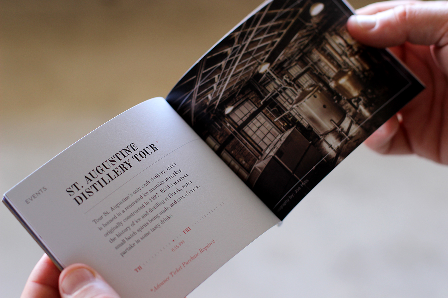
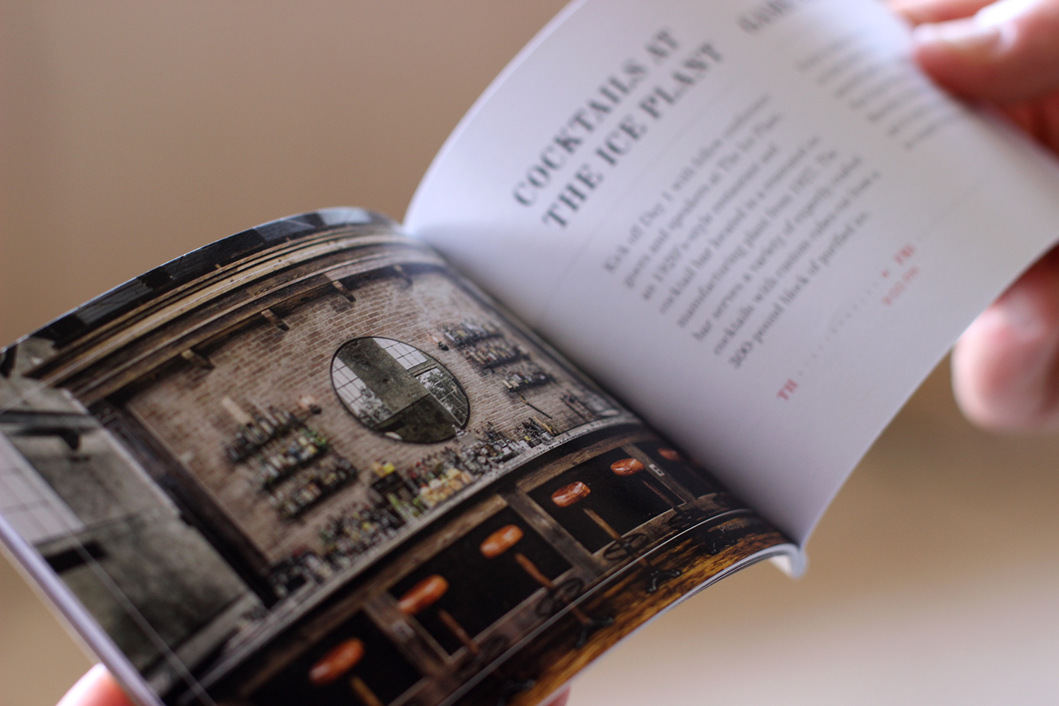
One thing that’s special about ACR is its events. This year we had a pirate ship ride, distillery tour, game night, and a sponsored happy hour. Ready to sign up for the next Ancient City Ruby yet? Information about the events was listed in the lanyard booklets along with some slick photography. I had a lot of great images between a few gems taken in previous years and other photos that we got permission to use (thanks, Joe Mills).
Some Personal Touches
As designers, we are constantly looking for opportunities to bring delight to people through our work; our conference lanyards were no exception. Here are a couple of other little details that we’re really proud of:

There’s a reason why attendees’ names were printed on covers of the booklets as opposed to being handwritten: it feels more special—more valuable. I often feel rushed and unappreciated when waiting in line at the registration table, while a well-meaning conference worker asks me how my name is spelled. This is one of the first experiences at a conference event and is a huge opportunity to convey appreciation and value for your guests. Presenting an attendee with a lanyard that has their name pre-printed on it communicates something entirely different than fumbling to write a name down while being filed through a registration table.

We here at Hashrocket wanted to do something special for those who have attended Ancient City Ruby in the past, so we designed unique buttons for first, second and third-year ACR attendees. It was a simple gesture to help our growing community of ACR faithful feel recognized and appreciated.

Folks from all over the world were attending Ancient City Ruby. We wanted them to have a enjoyable experience, yes—but also wanted to show Hashrocket’s appreciation and add a personal touch. Designing a conference lanyard that provided value, meaning and ultimately enhanced the experience—now that was important, even if, in the end it still looks like a glorified necklace.

